The Brutal Truth Behind My Image Selection Process for My Fine Art Print Store
- yzhensiang

- Jul 28, 2025
- 2 min read

Personally when it comes to curating images for my print store, the hardest part isn't choosing what to include—it’s deciding what to leave out. Over time, I’ve developed a tight technical tolerance, and honestly, most images that I have shot since a decade ago don’t make the cut.
Looking beyond the obvious criteria—subject matter, mood, story, and spatial balance. Each image goes through a brutal round of technical inspection. This is the heart of my fine art print image selection process. I zoom in, edge to edge, checking for pixel-level sharpness, tonal transition and clarity. If there’s any hint of noise, motion blur, or focus shift, it will automatically be rejected—no matter how emotionally strong the frame may be.
Here are some of the rejected images. (Top of the collage being the original size image and bottom being the enlarged image showing the issue of the image)


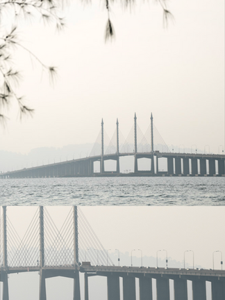
Some might call this excessive. Maybe it is. But I view prints as a permanent object. They live on walls, in frames, in homes. And I need to know that every piece I offer can stand up to close, critical viewing when printed large—not just look good on a phone screen.
This level of discipline hurts sometimes. There are good images I’ve had to let go. But in the end, I’d rather show fewer, stronger images than compromise on quality.
So, how tight is your image selection process? And more importantly—what are you willing to reject?
The second batch of fine art prints is now live—and there’s a new addition: the Panoramic Series. Each piece passed the same ruthless curation wall.
Visit the store here to explore the collection.


Comments